Assistant Professor
Department of Mathematical and Statistical Sciences
University of Colorado Denver
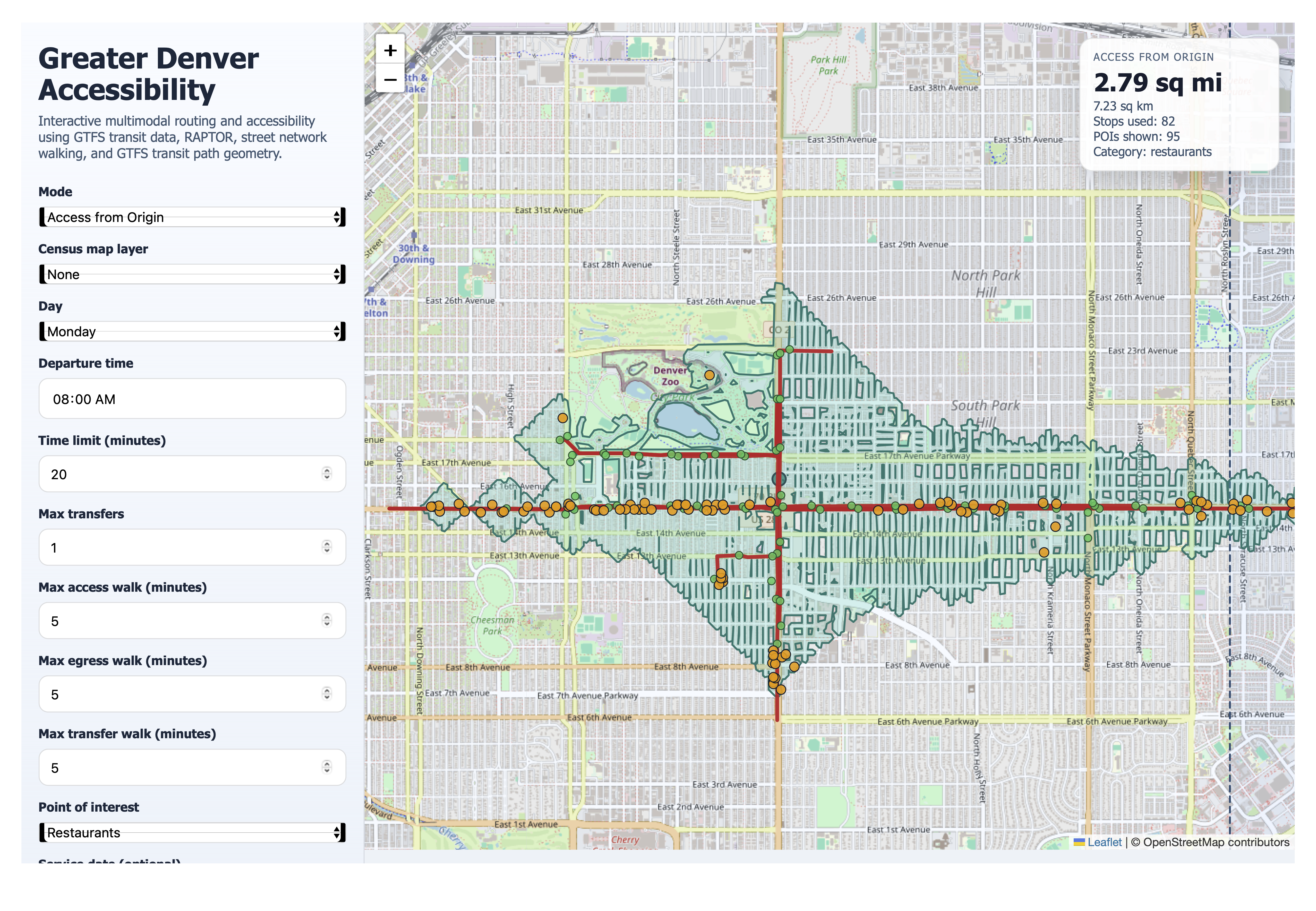
My recently graduated MSc student Matt Eimers and I have been developing an interactive transit service plan visualization tool. The tool uses publicly available sources such GTFS feeds, OpenStreetMaps, osmnx, and the Census. It implements a well-known transit routing algorithm (RAPTOR) to visualize, for any city, day of week, and time of day, not only where one can go from any given point in the map, but what one can access. This tool was developed using AI; I hope this particular use case is one that advances social good. Check out the example below. I can't stress enough how cool I think this is!
Here's a link to its Github repository.
The following is work in progress! It is a collaboration between me (in my role as a CU Denver faculty member) and friends at Greater Denver Transit.
This work combines publicly available GTFS data, other spatial data, and a mathematical optimization model (similar to the one in the Documents section below) to "propose" route frequency changes in the Denver metropolitan area under a variety of scenarios. Currently, it only considers frequency changes on existing routes. However, it may be easily adjusted to incorporate a given set of candidate routes. To give you a sense of the main source of difficulty: there are over 7,000 bus stops in the Denver metropolitan area. This induces over 49,000,000 origin-destination pairs!
George Box famously said "all models are wrong, some are useful." There are lots of assumptions in this mathematical model, most of which are "wrong." All assumptions will be thorougly explained (if and) when this work is formally published. I am a firm believer that applied math is the hardest of all maths: this work is a small step in a long, iterative process for real-world impact.
Click on any point on the scatter plot to assess the corresponding service plan. The symbols are:
The display buttons control whether to show the service plan, the routes with service gain, or the routes with service loss (all with respect to the current service plan).
In the maps, the different lines are color-coded and their width is proportional to their frequency. There are more lines than colors I can distinguish, so the colors may be repeated. Lines that overlap in their physical route may overlap in their rendering (again, this is work in progress). The dots represent bus stops; their size is proportional to the number of amenities within walking distance (on a logarithmic scale).